Timeline
Sept 2022 - Dec 2022
Skills/Tools
Figma, Interaction design,
User testing, User research,
Wireframing
Periods (not the punctuation mark).
While there is a multitude of period apps that serve the same general function — to track one’s period — Flo remains one of the top apps with its millions of users. However, despite the alleviation of some difficulties that period apps have helped with (e.g. tracking periods, pregnancy, and symptoms), there appears to be a lack of a social aspect to these apps.
Discovering the people problem through user research.
With this in mind, I set out to do user research with the objective of identifying if there is a need for a social space for Flo users. After interviewing a former user of Flo, a current user of Flo, a mother who doesn’t use Flo, and a boyfriend who also doesn’t use Flo, people expressed that:
When I am on my period or when a friend is on their period, I want to be supported/I want to support physically and emotionally, but I can’t do that because
There may not be a space conducive to bringing up this heavily stigmatized topic.
There are minimal resources and ways to find immediate and direct support.
I do not want to always explicitly communicate that I am on my period.
I set my goal to develop a feature on Flo that would break down the stigmatized barrier around periods and give women who go through periods opportunities to support and be supported.
To the brainstorming the board...also known as the door of my dorm.
I recruited two individuals (big thank you to Nancy and Winston!) to help me brainstorm, and we narrowed the potential feature into three opportunity areas: user communication, facilitating open communication, and providing external help. Within these opportunity areas, we generated a ton of potential solutions.

There’s nothing quite like a good ol’ analog way of whiteboarding.
Flo
Design System
01 Typography
02 Colors
03 Spacing
04 Assets
01 Typography
02 Colors
03 Spacing
Font(s)
Hierarchy
SF Pro
Aa
Aa
Aa
Aa
Aa
Regular
Medium
Semibold
Bold
Heavy
Style
Size
Weight
Usage
H1
Bold
Main period update on homescreen
H2
H4
Semibold
Toggle bar, buttons, panel text
Body
H3
Bold
Month on calendar, my daily insights
Regular
Unhighlighted dates, settings options,
Semibold
Panel text
46px
20px
16px
15px
11px
Brand
Grayscale
Toggle, icon, highlighted dates
#F66181
“+” button, ovulation dates
#4EA1A4
Symptoms
#9ABEE0
Health Assisstant
#F0ABB8
Chances of getting pregant
#CDBB5E
Notification Banner
#F4ECED
Gradient feather icon
#F4ECED
Botton nav bar
#F8F8F8
Classic white
#FFFFFF
Line divider
#E5E5E5
Default background
#F3F3F3
Highlighted icon, misc. dates, primary text
#000000
Toggle bar, nav bar text (bottom), arrows
#ACACAC
Toggle bar text (top nav),
#6F6F6F
Gradient pink default background
#FEF8FD - F9DFF0
65px; spacing between icons on bottom nav bar
10px; spacing between panels
35px; spacing between calendar dates
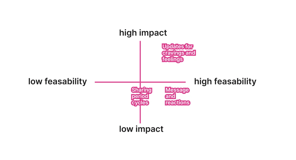
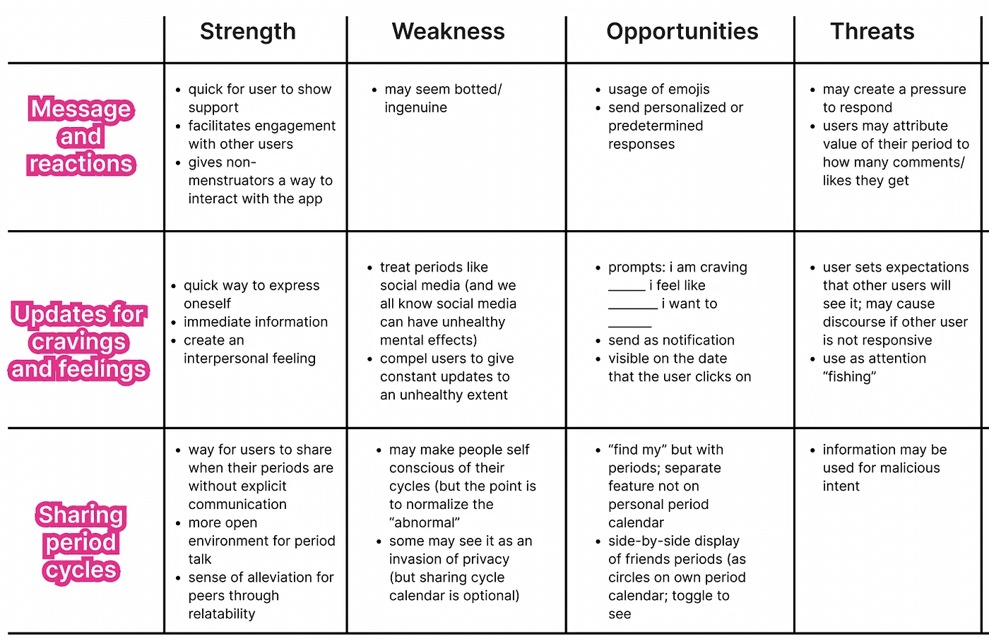
Now, to narrow them down.
There were three solutions that I narrowed down to and conducted a SWOT (strength, weakness, opportunities, threats) evaluation on them. Then, I placed them on a feasibility/impact matrix.
Message and reactions
Updates for cravings and feelings
Sharing period cycles through the Flo calendar
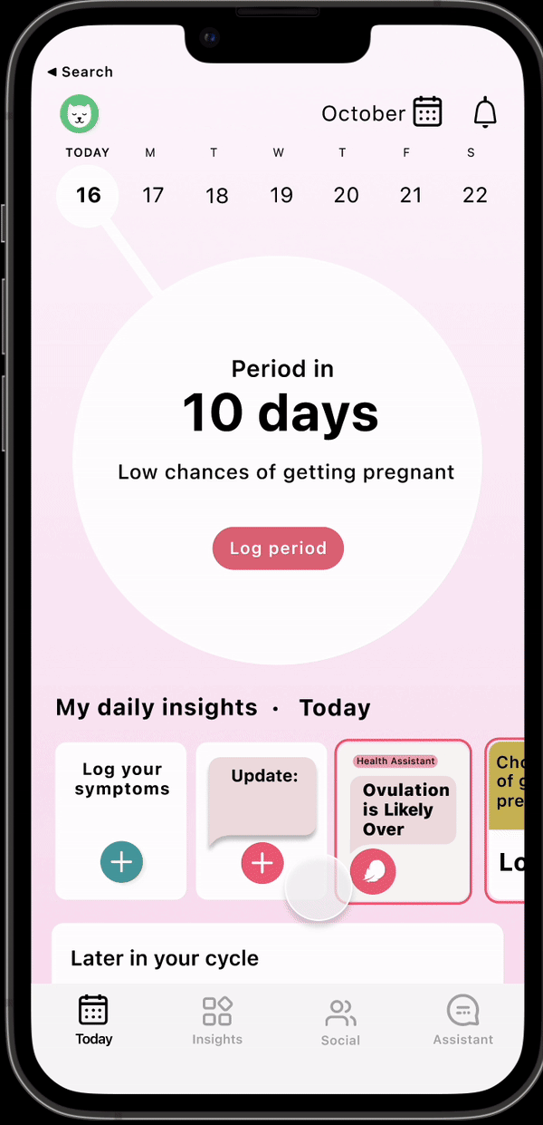
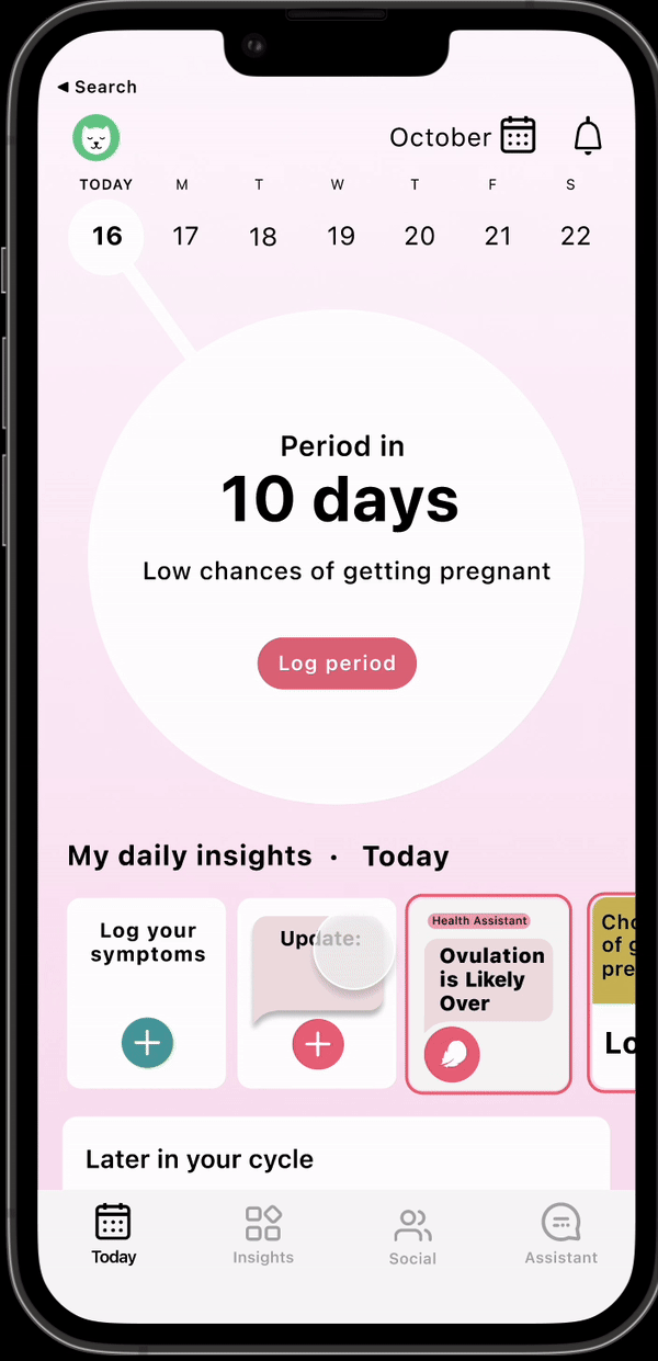
The final winner! The Updates feature (option 2).
This feature intends to encourage users to share how they feel both as a way for them to document themselves and for other people to view their status. It creates an environment for users to talk about their periods in an extremely casual manner and gives users an opportunity to feel supported through a digital barrier.
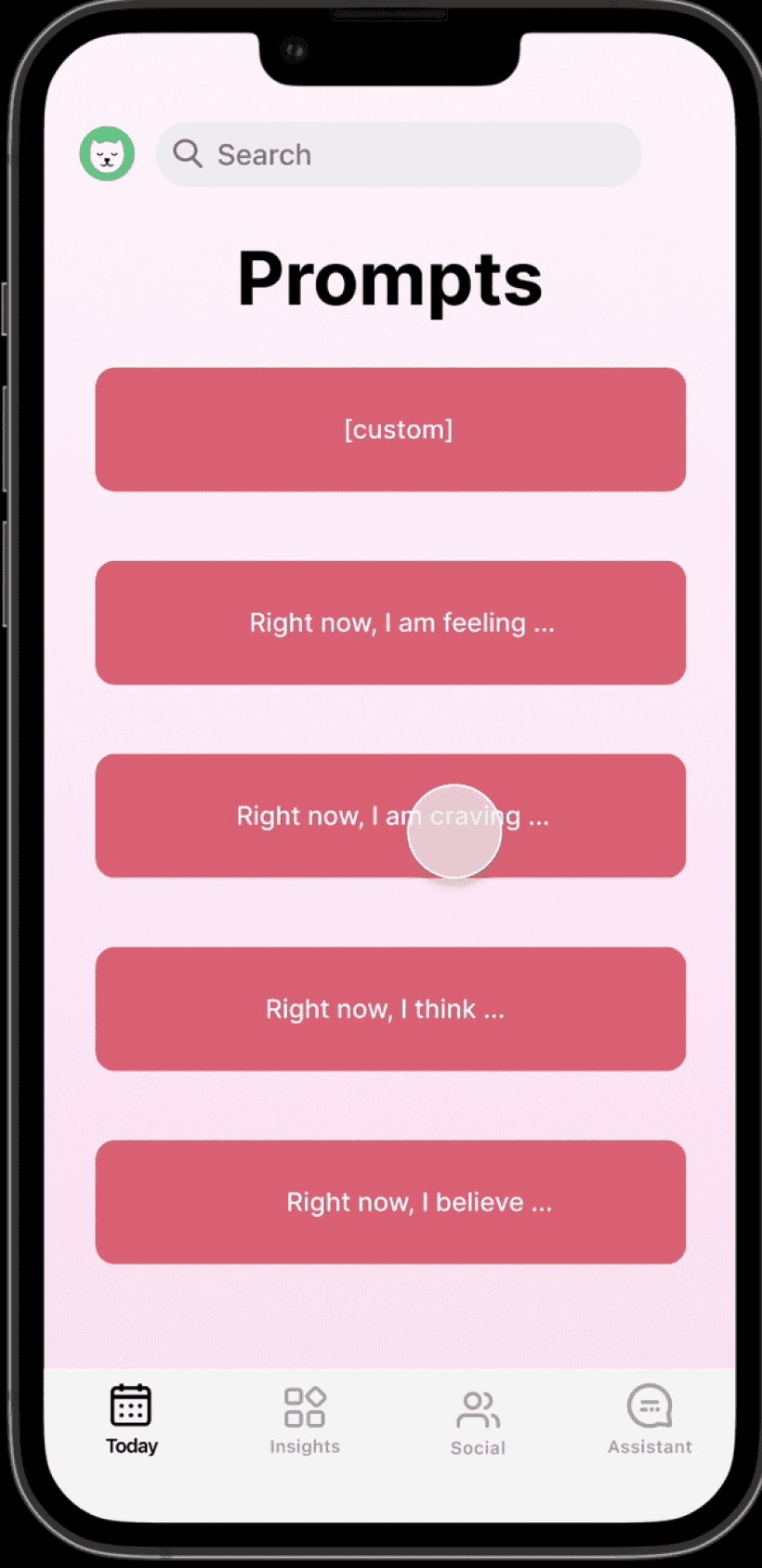
How do I encourage user updates?
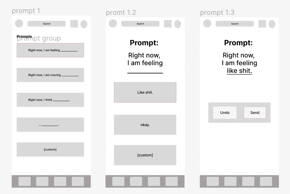
At first, I was unsure of how to proceed with having users post their updates. Should they be manually typed out? Should there be a “prompt of the day?” I didn’t want to force users to answer a prompt that they did not want to, but I also wanted to provide guidance to help users create their updates.
I ended up going with a happy middle way between the two options; not full autonomy but not full restriction; users would be able to choose from a set of prompts if they wish or they could type in a custom update. This way, they could choose a prompt if they do not know what to write or draw inspiration from them to create their custom update.
One thing I completely missed.
After deciding on this feature, I had to go through the process of identifying feature and content requirements. It wasn’t until then that I realized that I had jumped the gun; a missing part in my solution was that it did not address how users were going to befriend each other in the first place! In order to implement updates, I also had to implement an adding friends feature.
Thankfully, due to the large number of social media apps — Instagram, Facebook, BeReal, Snapchat — that all revolve around adding friends, drawing inspiration and ideas for this feature was not difficult. I then proceeded to the visual design process.
Visual design process
My initial (low-fidelity) flow looked like this:
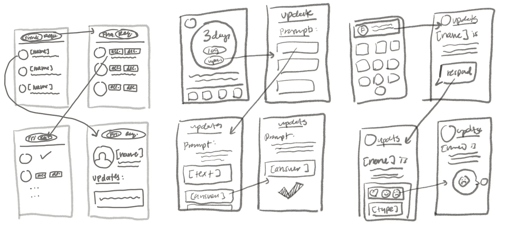
(from left to right) adding friends feature, updates feature, reacting to updates
I first had to ask myself “what makes the most intuitive sens for users to access and use the feature?” (aka the entry point).
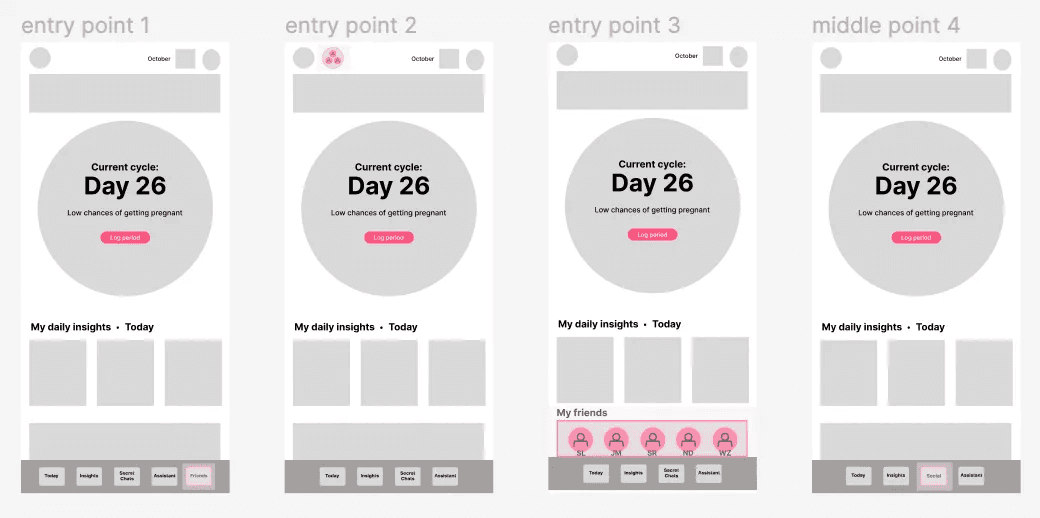
Friends entry point
For the friends feature, I explored four different entry points that could be accessed through either the home screen (entry points 2 and 3) or the bottom navigation bar (entry points 1 and 4).
I ultimately decided on the last option 4 because
option 1 cluttered the bottom navigating bar
option 2 (which has its entry point next to the personal profile icon) appeared awkward
option 3 added too much content to the already content-filled homepage
However, option 4 combines the pre-existing “secret chats” (an anonymous chat forum) with the friends feature to create a new social feature, which took the place of the secret chats feature that was on the bottom navigation bar.
Friends middle and end point
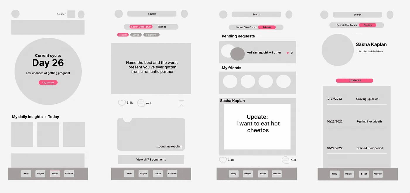
For the Friends feature, I did a total of 6 explorations. At this point, I decided to proceed with this exploration; users would click on the social button on the bottom navigation bar and land on the Secret Chat Forum first. Then, they’d be able to toggle between this page and their Friends page in which they would have the ability to view their Pending Requests to either accept or decline and their Friends list by clicking on the panels. Or, users could simply scroll down on the page to view their friends’ updates (the display of the update followes the same style as the Secret Chat posts). Since there was technically no “end,” I set the end point to just be a display of a user’s profile.
Updates entry point
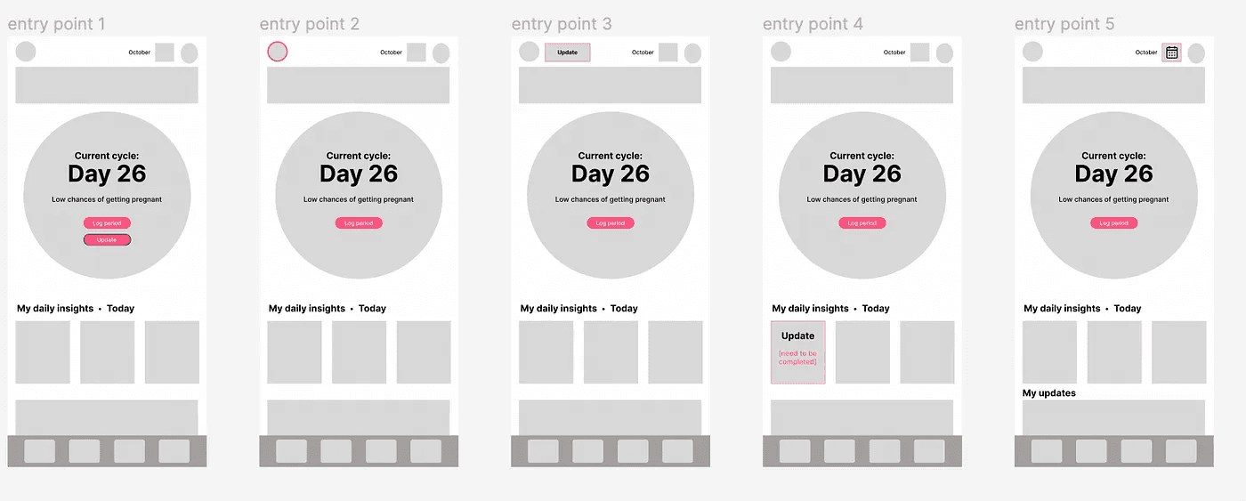
For the updates feature, I explored five different entry points. Option 1 adds the updates feature right below the “log period” feature; option 2 has users update by visiting their profile first; option 3 places the updates button next to the profile icon; option 4 adds a new panel under “my daily insights”; and option 5 first have users click on the calendar in order to log their update. I was, ultimately, between option 1 and 4, but went with 4 because option 1 detracted from the main purpose of the app — to track one’s period as the button was in extremely close proximity to the “log period” button— and two bars stacked in a confined circle was slightly claustrophobic.
Updates middle point
For Updates, I did a total of five explorations and narrowed it down to two. The first exploration has the prompts displayed first. Then, once users choose one, they answer on the following page. On the third screen, they verify that they want to send out their update.
Unlike the first exploration, the second exploration only has two screens as it displays both the prompts and the available answers that users can choose from on the first screen and then the verification on the second screen.
I ended up going with exploration one as critique from user testing noted that the spacing in the second exploration leads to a higher potential of “fat fingering” the answers and overall, visually, the first exploration is less cluttered.
Updates end point
For the end point, there were two explorations being considered. The first one displayed the Update on the home screen period circle. While it was very visible as to where and what the update was, it led to way too much text; and, the sudden appearance of the text was jarring and out of place.
The second exploration displayed the Update under the “my daily insights” panel, which is also on the homepage. However, since this was also the entry point for the feature, it led to a more seamless transition between the empty state and the final state of users inputting an update. And, there was no additional space taken up.


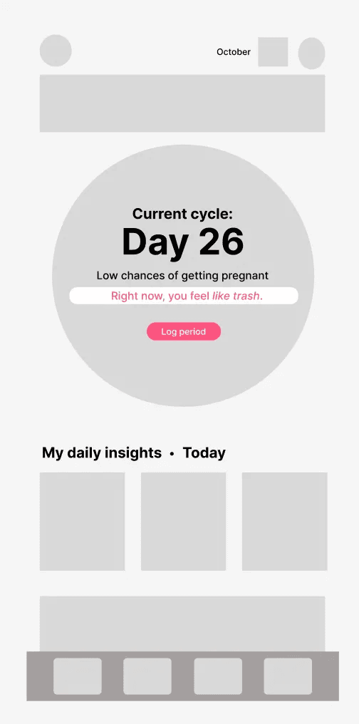
Therefore, I went with the second end point exploration.
Feedback and changes!
Edits, adjustments, changes…they were made according to user feedback along with critique from critique group peers and TAs.
Instead of giving users answer choices, they have to write out their answers. In doing this, it prevented the need to come up with varying yet encompassing answers.
Rather than having “______” following the prompt, “…” was utilized. This was for better spacing and uniformity.
Before there were two separate pages for friends — one for pending requests and the other for viewing the actual friends list — but this didn’t make sense. The two pages were collapsed into one with pending requests displayed first.
The toggle bar to switch between Secret Chat Forum and the Friends Page was changed into a tab bar instead; the page that the user is on is emphasized through a darker gray along with the signature pink of Flo which decluttered the top portion of the screen and allowed for better spacing between each element.
Finally…
Want to add friends? This is how you do it!
This feature allows users to update their friends on their current ‘period status’ (i.e. how they are feeling, what they are craving, etc.).
Reflection
This case study is my very first, and it was truly a learning experience. Digital Product Design (the course) has given me a taste of the interactive world of design; to list a few things that I learned…
the process of problem-solving (using design)
the importance of designing with a user-focused perspective
the amazing things that can be done with Figma
In addition, conducting this case study has turned me into a more attentive person when interacting with both tangible and intangible products. When creating the visual elements for the feature, I had to take into account the title case, the tone, the brevity, and the punctuation of Flo. And, in order to do this, I had to carefully analyze the app and pay attention to minute details that I would have simply glanced over before. The way that all the aspects of an app come together, in the end, is amazing to see.
If I had more time…
I would build more on the aspect of interacting with the updates that users post (e.g. reacting, commenting). During this case study, I mostly focused on adding friends and the process of updating. But, I think if I built more on user-user interaction, it would have provided a more cohesive output.
What’s next?
Design is definitely a field that I am interested in pursuing. It acts as a middleman between software development and working with people, and most importantly, it aims to enhance and optimize user experiences. I hope to conduct more case studies, and find ways to practically apply the skills that I’ve learned throughout this course while continuing to develop myself as a designer.
This project has no affiliation with Flo; it was a case-study conducted for the Digital Product Design course.

Flo & Friends
Normalizing Period Talk (One Friend at a Time).
UX Design
Prototyping
User testing
User testing

Made with a cat by my side ⋆˚✿˖₍^. ̫.^₎ @ 2024